

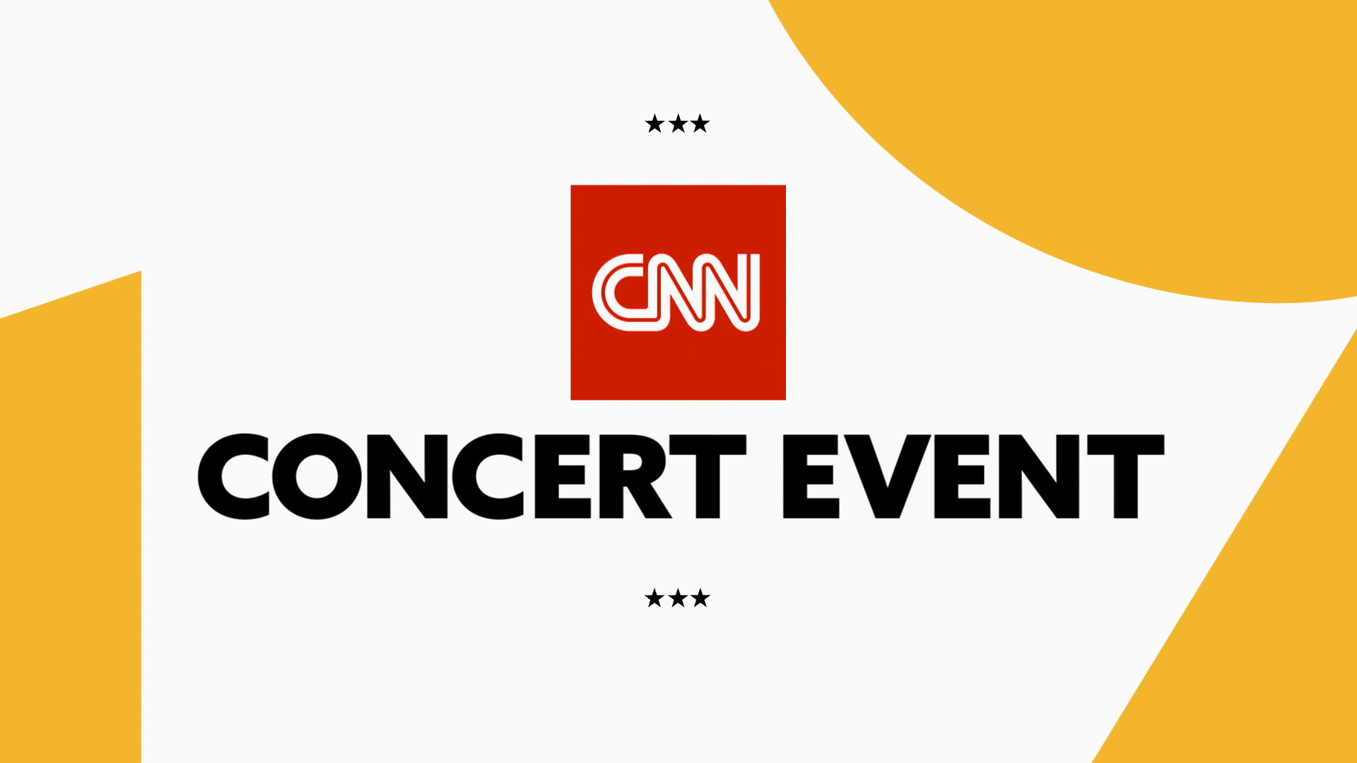
CNN - JUNETEENTH Lunch Campaign
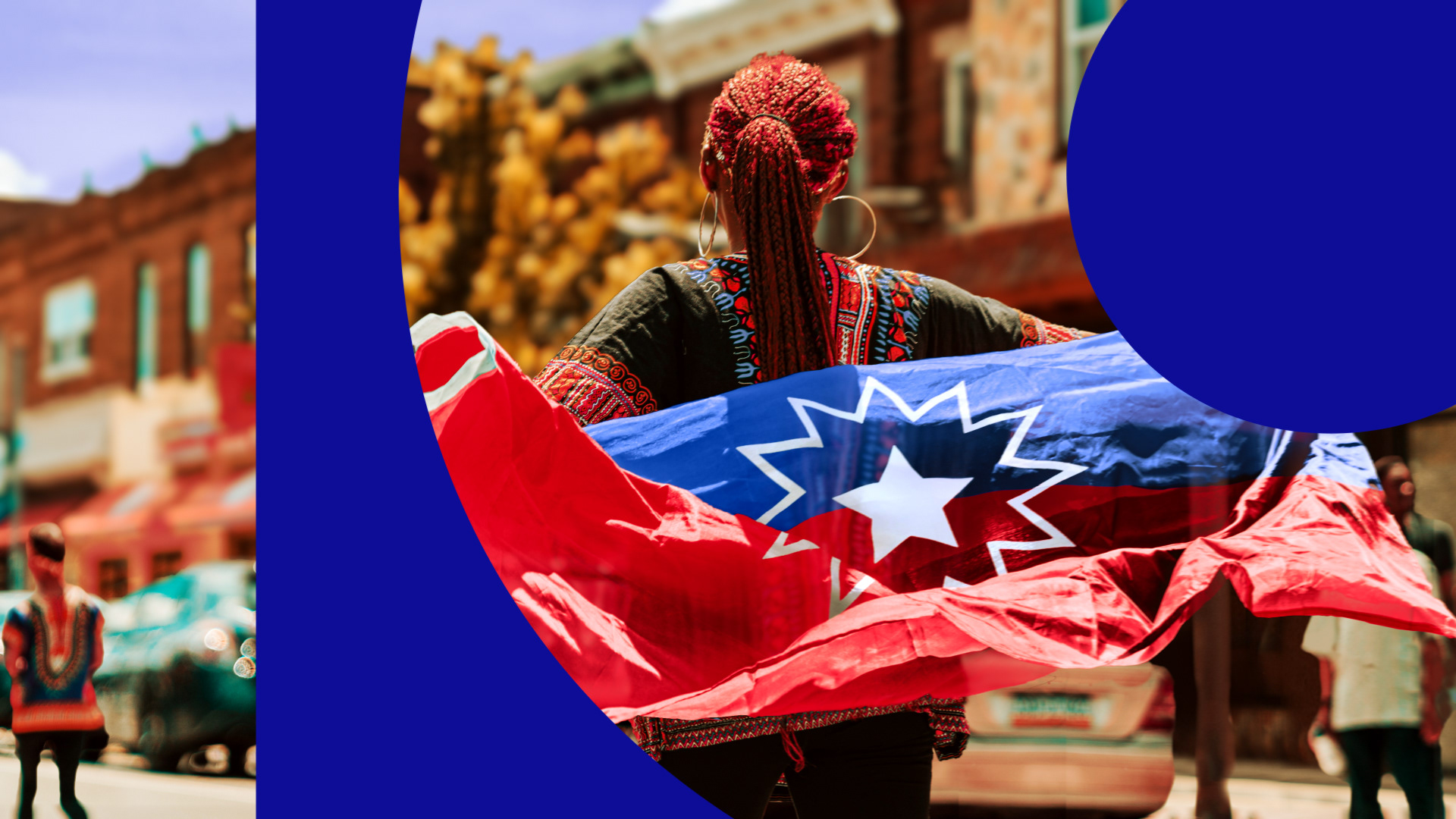
Built for CNN’s Juneteenth: A Global Celebration of Freedom event, this project grew from a concept that established the campaign’s visual language through bold typography, oversized numeric forms, shape-driven composition, and a culturally resonant color palette.
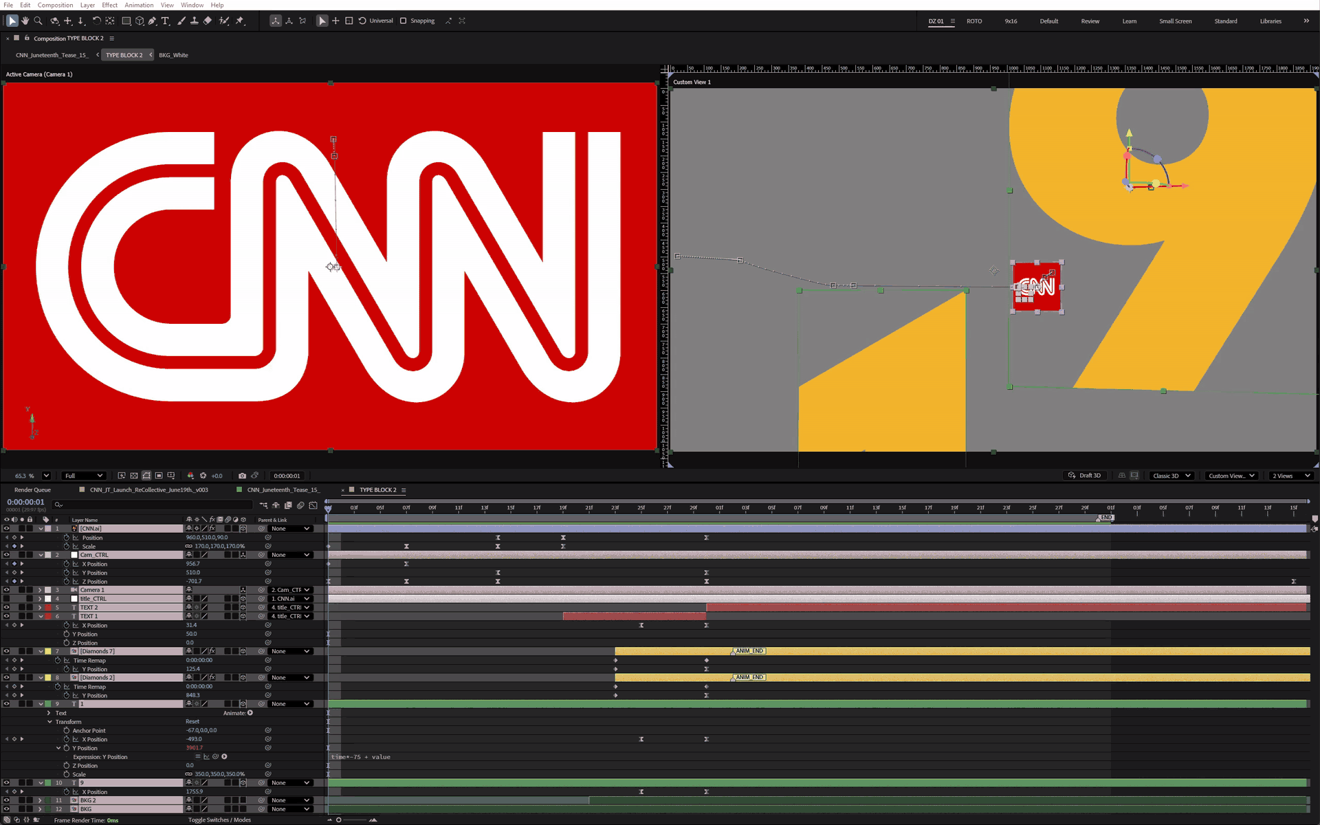
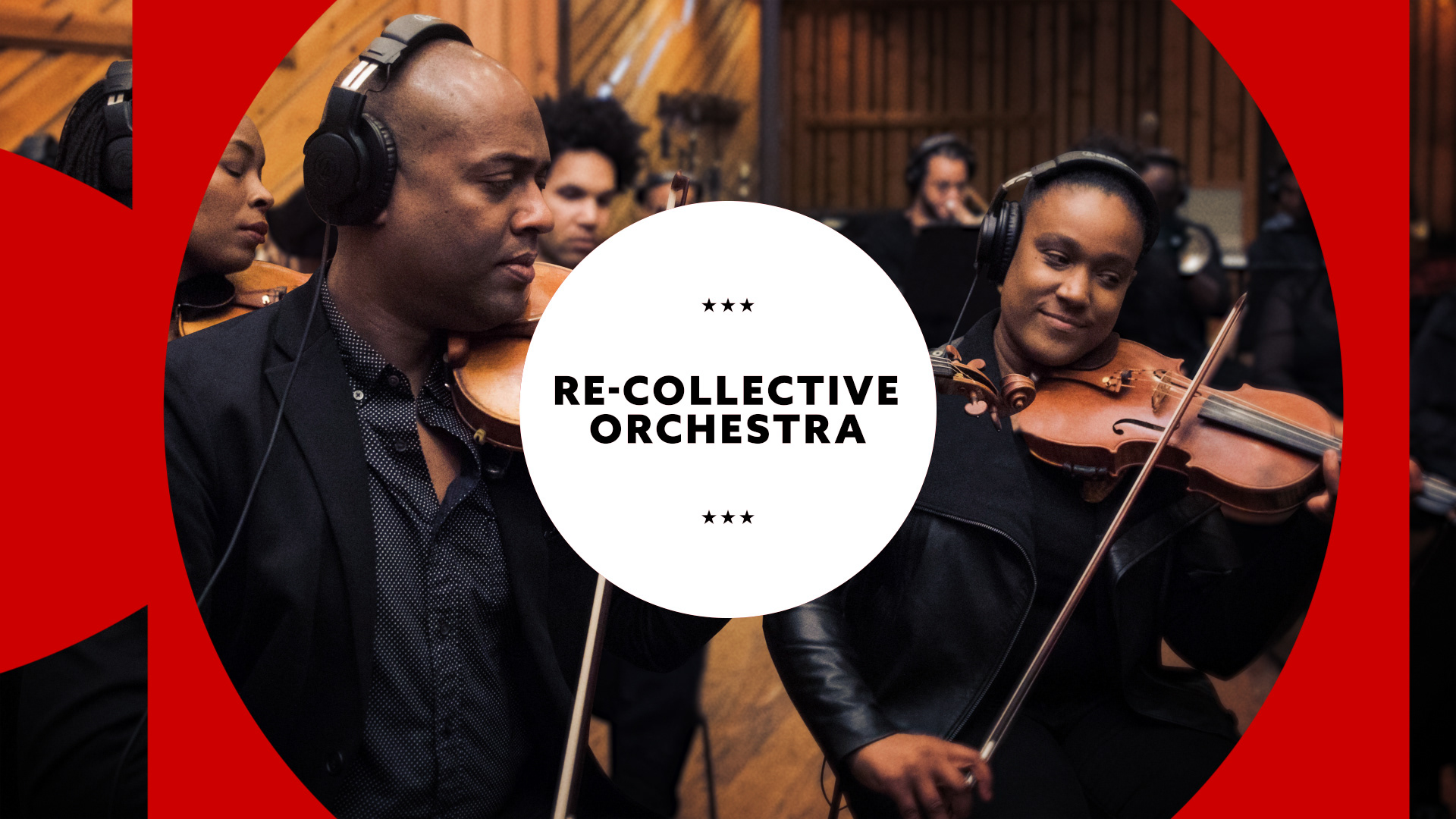
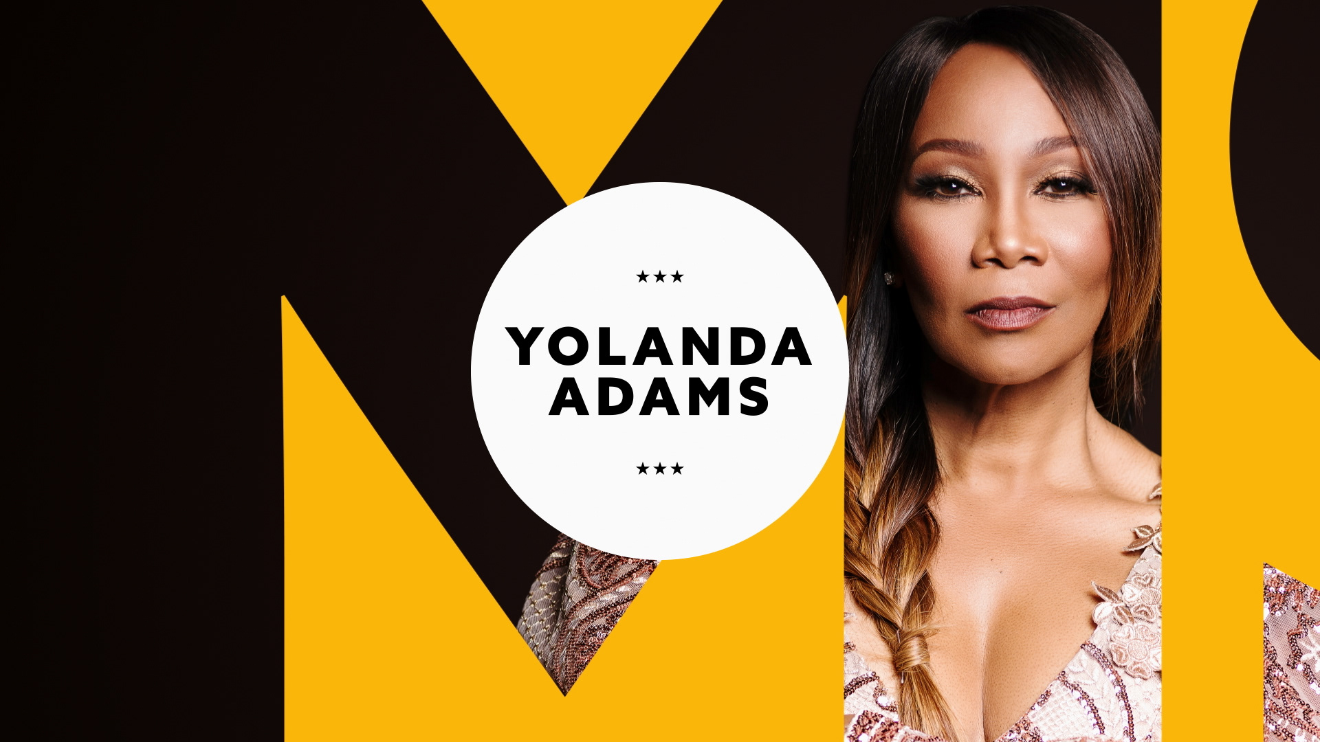
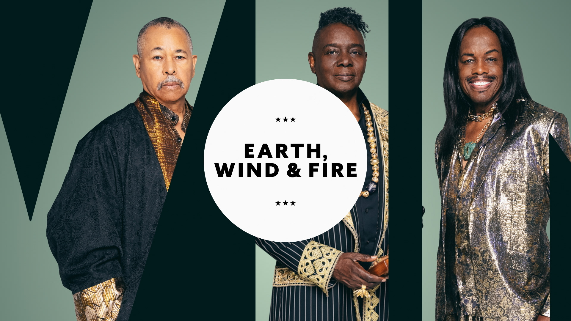
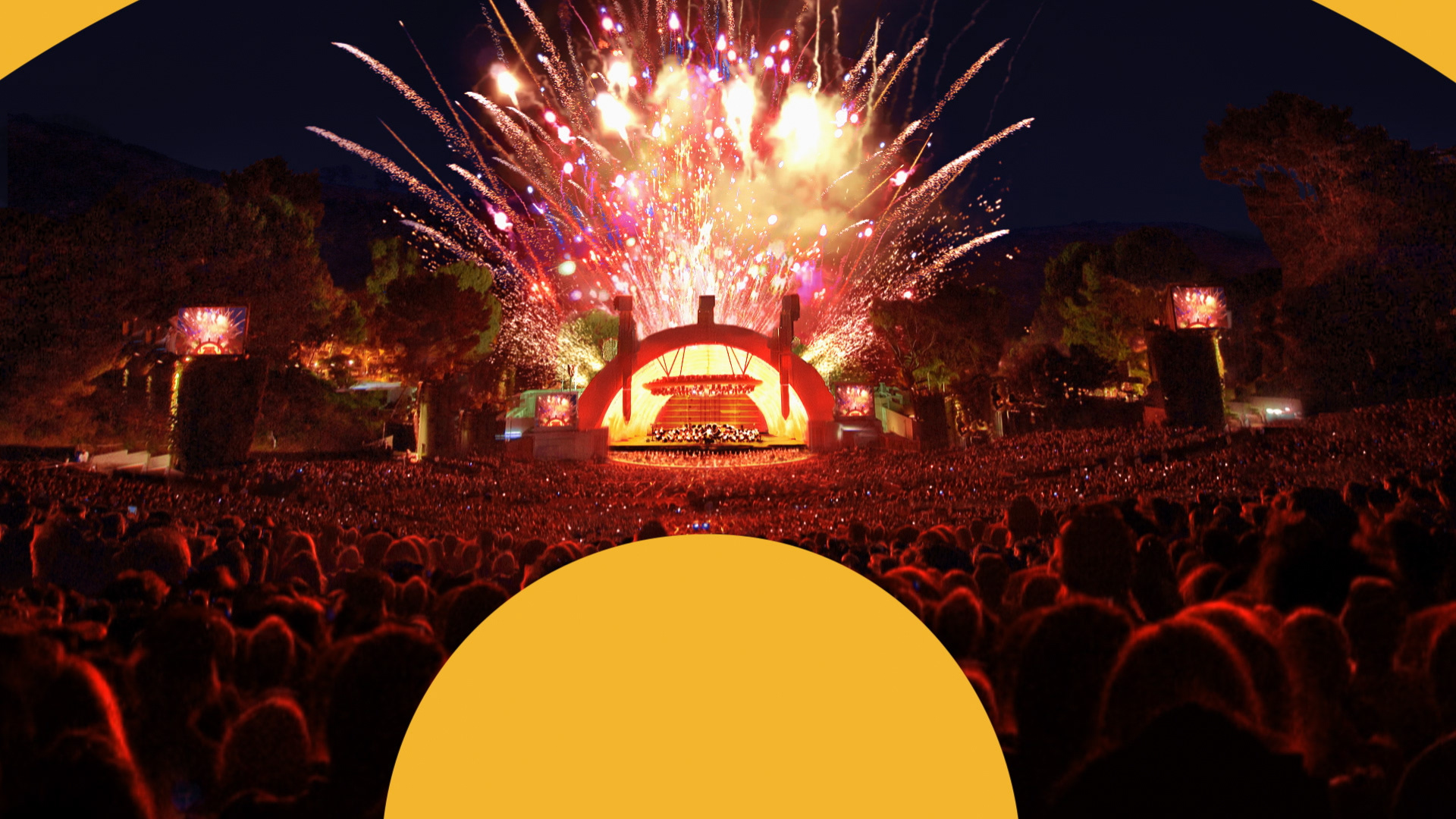
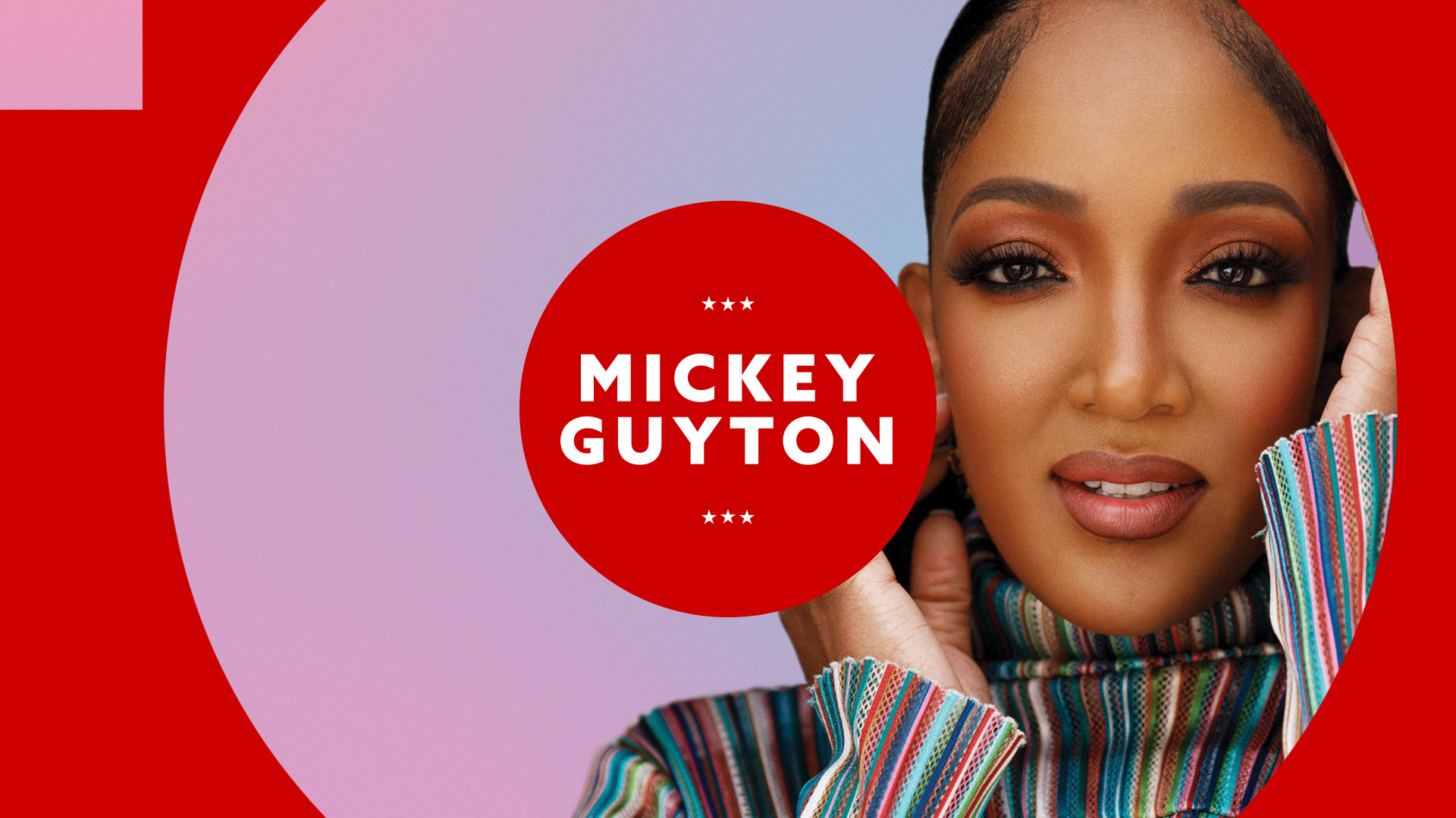
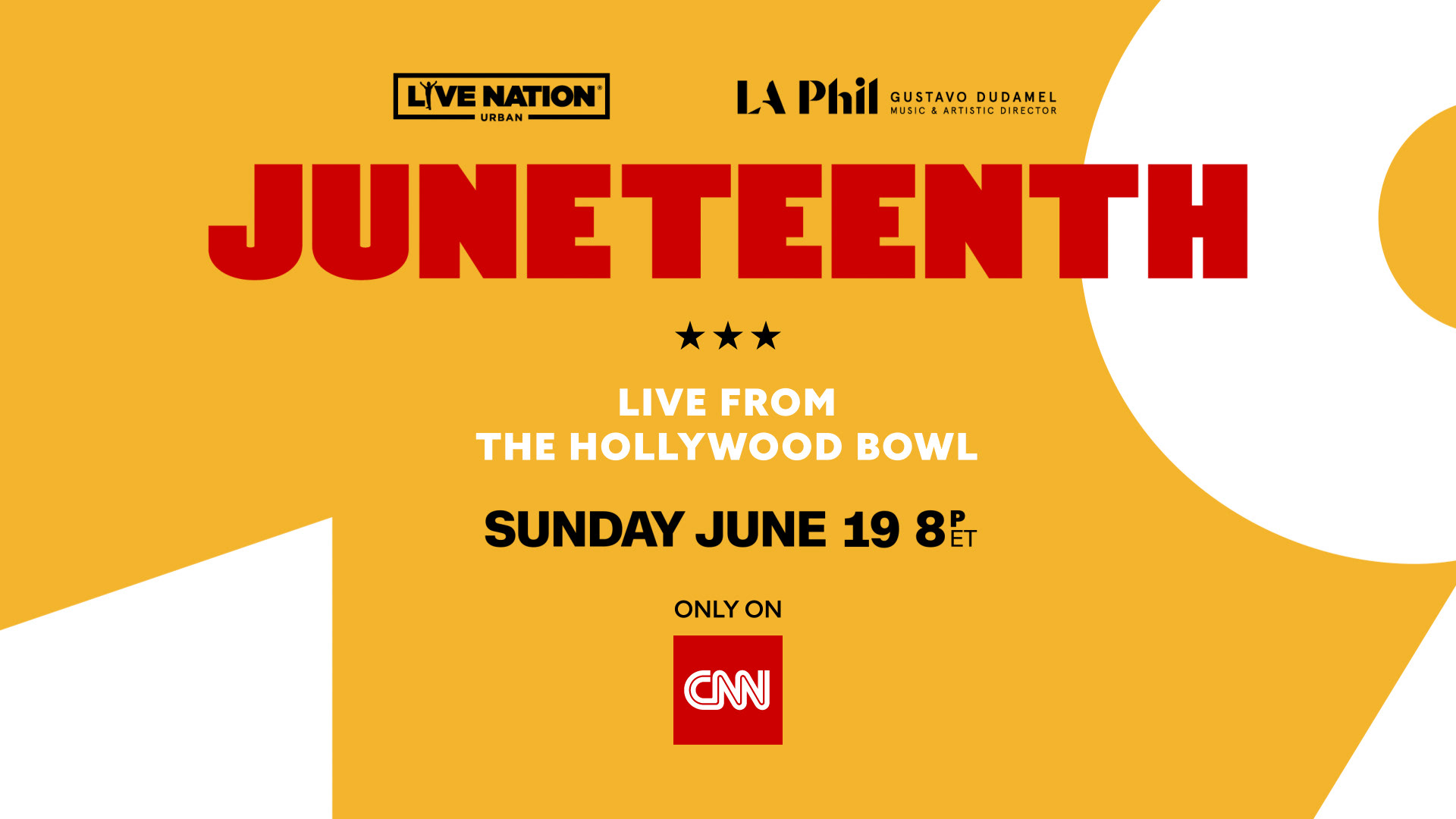
A key part of the approach was creating a modern, minimalist aesthetic that felt clean, elevated, and contemporary while still retaining the event's energy and cultural significance. Designed to extend across multi-media deliveries, the system was anchored by the line “LIFT EVERY VOICE” and shaped to capture the scale, rhythm, and celebratory spirit of a live event from the Hollywood Bowl.
Building on that foundation, we developed the visual direction throughout the broadcast and social media packages, refined the concept, and applied it to title cards, artist cards, transitions, and other on-air elements, creating a cohesive, flexible, multi-screen-ready design system.
client | CNN
production | A-TEAM
production | A-TEAM
executive producer | Nikki Blaszyk
creative director | Ben Frank
creative director | Marni Wagner-Nassau
design director / designer | Luis Martinez
editor | Jeff Morelli
editor | Jeff Morelli
lead motion graphic artist / designer | Dmitri Zavyazkin
animator | Kevin Leotti
Design Exploration
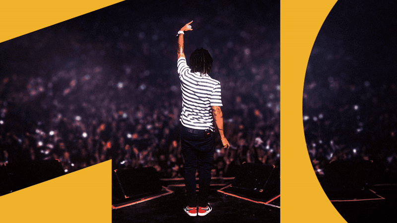
Concept 1
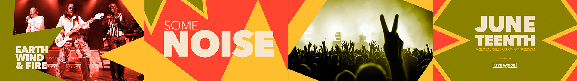
A bold, playful direction with a more free-spirited and celebratory tone. Vibrant color, diverse imagery, and cutout-inspired composition create a lively, music-driven visual language. The overall system feels expressive and energetic, giving the package a more eclectic and festival-like character.
A bold, playful direction with a more free-spirited and celebratory tone. Vibrant color, diverse imagery, and cutout-inspired composition create a lively, music-driven visual language. The overall system feels expressive and energetic, giving the package a more eclectic and festival-like character.
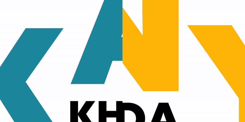
Concept 2
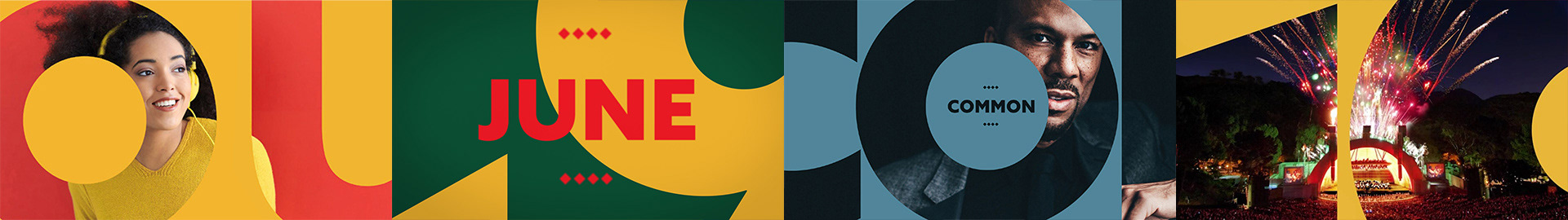
A more refined, minimalist, and contemporary direction centered on typography as the primary design element.
The date and artists become a central graphic device through scale, cropping, and negative space. Combined with bold color and clean structure, the system feels modern and visually striking.
A more refined, minimalist, and contemporary direction centered on typography as the primary design element.
The date and artists become a central graphic device through scale, cropping, and negative space. Combined with bold color and clean structure, the system feels modern and visually striking.
Animation Exploration
Once the visual language was established, the project moved into motion development, where the animation logic, pacing, and editorial rhythm were defined to give the package its movement and presence. The animation approach was kept clean, simple, and highly editable to support the versatility of the broader graphic package, preserving the energy while allowing snappy movement, smooth landings, and flexible application across various deliverables.
Title Cards in Motion

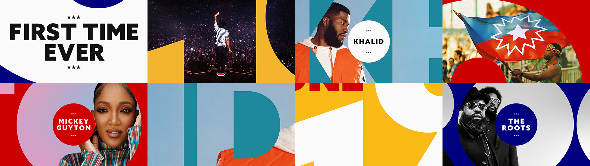
Artist Cards in Motion

Final Frames
my instagram
THANK YOU
THANK YOU